> ## Documentation Index
> Fetch the complete documentation index at: https://docs.supaboard.ai/llms.txt
> Use this file to discover all available pages before exploring further.
# Add filters to a dashboard
> Let viewers choose a date range, category, or another value without editing the dashboard.
A dashboard filter can control several widgets at once. For example, an **Order date** filter can update revenue, order count, and a monthly sales chart together.
## Before you begin
Open a dashboard containing data widgets. You need **Can create** access to add a filter, or **Can edit** to change an existing one, plus an editing role in the workspace. Know which source column represents the value you want people to choose.
## Open the filter editor
1. Open the dashboard from **Artifacts → Dashboards**.
2. Select **More options → Edit manually**.
3. Choose **Insert Filter** from the toolbar near the bottom of the canvas.
## Name the filter and choose its type
Enter **Name of Filter**, using the label viewers should see. Prefer “Order date” or “Customer region” over a database column name.
Choose **Filter Type** and, where offered, **Filter Operator**.
| Type | Use it for |
| - | - |
| **Category** | A selection of named values, such as a category or status |
| **Date Time** | A date range, month, quarter, or year |
| **String** | A text search or selection of text values |
| **Integer** | Whole numbers |
| **Numeric** | Decimal numbers |
| **Boolean** | True or false values |
For **Date Time**, choose **Date Range** when viewers should set a start and end date. For **String**, use **Fuzzy Search (Like)** for a partial text match or **Category Style (In)** for a value selection. Category-style controls can offer single or multiple selection and cascading suggestions.
## Choose the columns on each widget
The canvas shows a column selector on each compatible widget while the filter editor is open.
1. Open a widget's column selector.
2. Review the selected source columns. More than one compatible column may already be selected.
3. Keep only the column or columns that this filter should control.
4. Repeat for every widget the filter should affect.
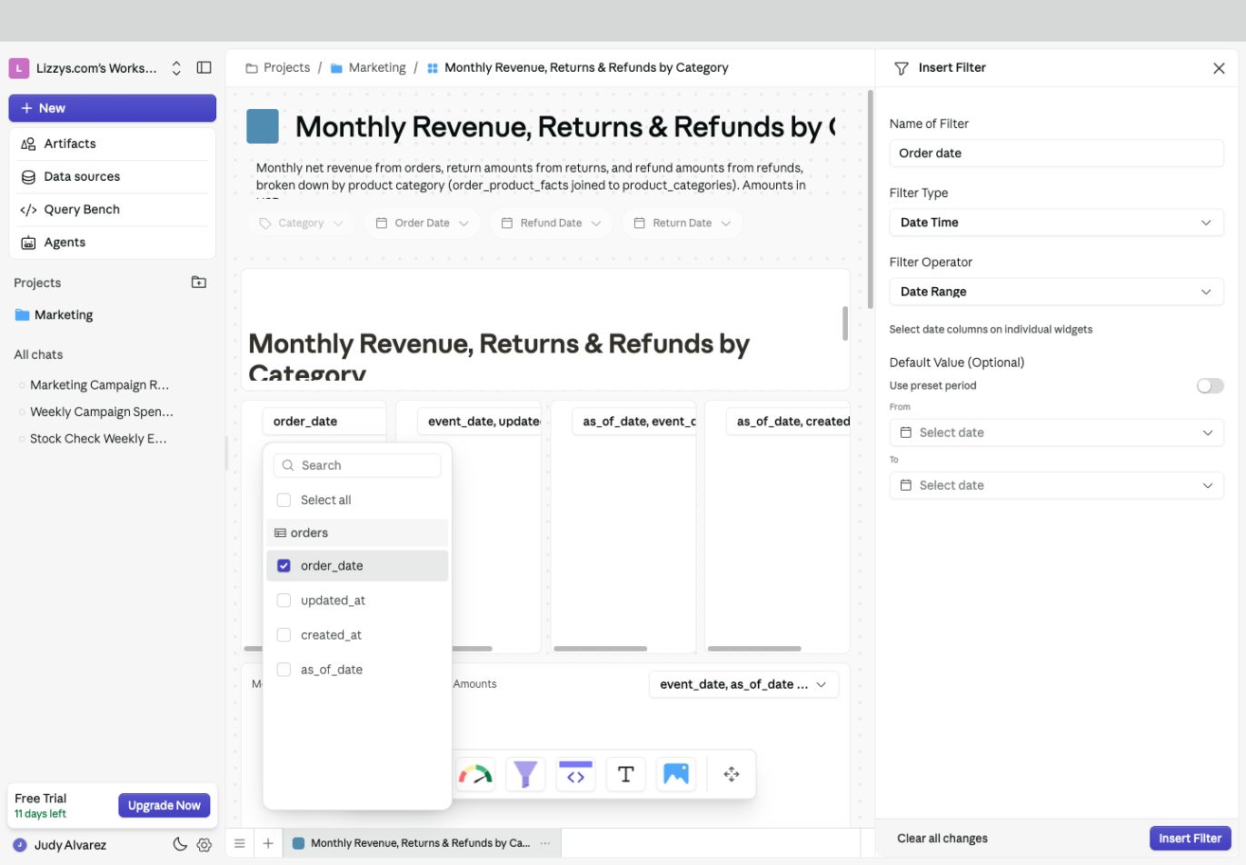 For a revenue widget, an order-date filter usually belongs on `order_date`. Selecting `updated_at` as well would also restrict when those orders were updated. For a returns widget, decide whether the same control should use the order date or the return date; make the choice explicit in the label or dashboard notes.
A widget with no compatible columns cannot use that filter. Check its source and the selected filter type instead of choosing an unrelated column.
## Set an optional default
Use **Default Value (Optional)** to choose the starting selection. For a date range, enter **From** and **To**, or turn on **Use preset period** and choose a relative period.
Use a relative period for a dashboard that should keep opening on a recent week or month. Use fixed dates for a review of a specific event.
## Save and test
1. Select **Insert Filter**, or **Save Changes** when editing an existing filter.
2. Save any remaining dashboard edits with **Save**.
3. In view mode, choose a value in the filter bar.
4. Check each intended widget and confirm that the result changes in the way you expect.
## Using filters on your dashboard
Viewers use the controls above the widgets. Choose a value or period, then wait for the affected widgets to reload. Clear the current selection when you want to broaden the view.
Filters combine: choosing a region and a date range narrows the data by both. A widget only follows filters mapped to its relevant source columns.
## Editing an existing filter
Enter manual edit mode and open the existing filter's edit control. Change the label, type, source columns, or default, then select **Save Changes**. Recheck the affected widgets in view mode.
## Deleting a filter
Open its edit panel, select **Delete filter**, and review the confirmation. This removes the filter control, not the source data. Save the dashboard edits when prompted.
## If the result is unexpected
| What you notice | What to check |
| - | - |
| A column is missing | The widget's data source and the filter's type |
| A widget ignores the filter | Its selected source columns; the query may also intentionally exclude filtering |
| Data disappears unexpectedly | Unrelated columns selected together, conflicting filters, or a period with no matching rows |
| Suggested values are too broad | Whether cascading suggestions are enabled and supported for the connection |
## Expected result
A viewer can change the selected date or value and see the intended widgets update together.
## Next steps
[Filter by clicking a table value](/dashboards/filters/filter-dashboards-from-table-data), [keep a benchmark outside a filter](/dashboards/filters/ignore-filtering-for-a-given-table), or [configure filters for an embed](/dashboards/embedding/add-filters-and-environments-in-embedded-dashboard-programatically).
This documentation is built and hosted on [Mintlify](https://mintlify.com), a developer documentation platform.
For a revenue widget, an order-date filter usually belongs on `order_date`. Selecting `updated_at` as well would also restrict when those orders were updated. For a returns widget, decide whether the same control should use the order date or the return date; make the choice explicit in the label or dashboard notes.
A widget with no compatible columns cannot use that filter. Check its source and the selected filter type instead of choosing an unrelated column.
## Set an optional default
Use **Default Value (Optional)** to choose the starting selection. For a date range, enter **From** and **To**, or turn on **Use preset period** and choose a relative period.
Use a relative period for a dashboard that should keep opening on a recent week or month. Use fixed dates for a review of a specific event.
## Save and test
1. Select **Insert Filter**, or **Save Changes** when editing an existing filter.
2. Save any remaining dashboard edits with **Save**.
3. In view mode, choose a value in the filter bar.
4. Check each intended widget and confirm that the result changes in the way you expect.
## Using filters on your dashboard
Viewers use the controls above the widgets. Choose a value or period, then wait for the affected widgets to reload. Clear the current selection when you want to broaden the view.
Filters combine: choosing a region and a date range narrows the data by both. A widget only follows filters mapped to its relevant source columns.
## Editing an existing filter
Enter manual edit mode and open the existing filter's edit control. Change the label, type, source columns, or default, then select **Save Changes**. Recheck the affected widgets in view mode.
## Deleting a filter
Open its edit panel, select **Delete filter**, and review the confirmation. This removes the filter control, not the source data. Save the dashboard edits when prompted.
## If the result is unexpected
| What you notice | What to check |
| - | - |
| A column is missing | The widget's data source and the filter's type |
| A widget ignores the filter | Its selected source columns; the query may also intentionally exclude filtering |
| Data disappears unexpectedly | Unrelated columns selected together, conflicting filters, or a period with no matching rows |
| Suggested values are too broad | Whether cascading suggestions are enabled and supported for the connection |
## Expected result
A viewer can change the selected date or value and see the intended widgets update together.
## Next steps
[Filter by clicking a table value](/dashboards/filters/filter-dashboards-from-table-data), [keep a benchmark outside a filter](/dashboards/filters/ignore-filtering-for-a-given-table), or [configure filters for an embed](/dashboards/embedding/add-filters-and-environments-in-embedded-dashboard-programatically).
This documentation is built and hosted on [Mintlify](https://mintlify.com), a developer documentation platform.