> ## Documentation Index
> Fetch the complete documentation index at: https://docs.supaboard.ai/llms.txt
> Use this file to discover all available pages before exploring further.
# Format a KPI widget
> Make a headline metric readable with a clear label, units, and number format.
The KPI widget surfaces a single headline metric — a number, percentage, trend, or comparison — pulled directly from a query result. It is designed to be read at a glance.
## Before you begin
Add a KPI using the [dashboard editor](/dashboards/how-to/edit-a-dashboard) or reuse a result from the Analyst. You need editing access to change its appearance. Check that the underlying result measures the intended thing before changing its format.
## Format the metric
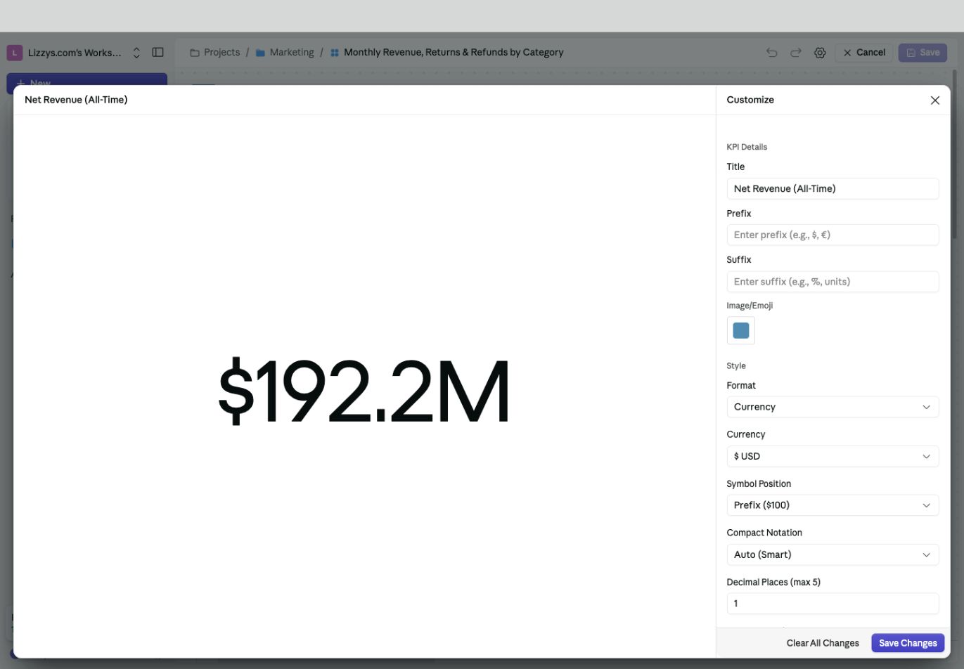
1. Enter **More options → Edit manually** on the dashboard.
2. Open the KPI's **Edit KPI** control.
3. In **Customize**, set a clear **Title** and choose the **Format**.
4. For a currency, select the currency and symbol position. Choose compact notation and decimal places to suit your audience.
5. Review the preview, select **Save Changes**, then save the dashboard edits.
 ## Reading the data
A KPI shows a prepared metric result. Check its definition, filters, and period before formatting it. A missing value is different from a genuine zero; investigate the source rather than adding a display prefix or changing precision to make it look complete.
## KPI types
A result can be a number, percentage, trend, or comparison. These describe the result itself. The **Format** control changes how its values are displayed; it does not turn a single number into a meaningful comparison with a previous period.
Ask the Analyst for the calculation you need, such as “Show completed-order revenue for last month and compare it with the month before.”
## Display options
Use **Title** for a label the audience understands. Add a **Prefix**, **Suffix**, or **Image/Emoji** where helpful, and check the preview for duplicate units such as a manually entered dollar sign next to a currency format.
## Number formatting
Choose the format that matches the meaning of the value:
| Format | Example use |
| - | - |
| **Number** | Order count or a quantity |
| **Currency** | Revenue, cost, or refunds; choose the currency and symbol position |
| **Percentage** | A rate; check whether the input is already scaled as a percentage |
| **Time (Duration)** | Elapsed time; choose the correct input unit |
| **Timestamp** | A date or point in time |
| **Weight**, **Volume**, **Length / Distance**, **Data Size** | A measured quantity with the appropriate units |
| **Ratio / Multiplier**, **Score / Rating** | A comparison ratio or score on a known scale |
| **Auto** | Let the available value determine the default presentation |
The options beneath **Format** change with your selection. For example, currency formatting offers compact notation, decimal places, separators, and negative-number presentation.
Changing a currency label does not perform an exchange-rate conversion. A rate stored as `0.25` needs different percentage handling from one stored as `25`; confirm the input scale in the preview.
## Compact notation
Use compact notation when a headline number would otherwise be difficult to scan. **Auto (Smart)** can show a large revenue value in millions; choose an unabridged display when the exact total matters. Use decimal places consistently across comparable KPIs.
## Show a trend or comparison
Ask for a trend or comparison result with an explicit time period and baseline. Review the direction of the change: an increase in revenue and an increase in refunds do not mean the same thing. Use a [chart](/dashboards/widgets/chart-widget) alongside the KPI when readers need the full timeline.
## Icon
Use **Image/Emoji** as an optional visual cue. Keep the title and units readable without relying on the icon.
## Expected result
The metric has an understandable title and unit, and the displayed precision suits the decision. Number formatting changes presentation; it does not correct an incorrect calculation.
## Next steps
[Add a date filter](/dashboards/filters/how-to-add-filters-to-your-dashboard) and check whether the KPI should respond to it, or [inspect the underlying data](/dashboards/how-to/explore-dashboard-data).
This documentation is built and hosted on [Mintlify](https://mintlify.com), a developer documentation platform.
## Reading the data
A KPI shows a prepared metric result. Check its definition, filters, and period before formatting it. A missing value is different from a genuine zero; investigate the source rather than adding a display prefix or changing precision to make it look complete.
## KPI types
A result can be a number, percentage, trend, or comparison. These describe the result itself. The **Format** control changes how its values are displayed; it does not turn a single number into a meaningful comparison with a previous period.
Ask the Analyst for the calculation you need, such as “Show completed-order revenue for last month and compare it with the month before.”
## Display options
Use **Title** for a label the audience understands. Add a **Prefix**, **Suffix**, or **Image/Emoji** where helpful, and check the preview for duplicate units such as a manually entered dollar sign next to a currency format.
## Number formatting
Choose the format that matches the meaning of the value:
| Format | Example use |
| - | - |
| **Number** | Order count or a quantity |
| **Currency** | Revenue, cost, or refunds; choose the currency and symbol position |
| **Percentage** | A rate; check whether the input is already scaled as a percentage |
| **Time (Duration)** | Elapsed time; choose the correct input unit |
| **Timestamp** | A date or point in time |
| **Weight**, **Volume**, **Length / Distance**, **Data Size** | A measured quantity with the appropriate units |
| **Ratio / Multiplier**, **Score / Rating** | A comparison ratio or score on a known scale |
| **Auto** | Let the available value determine the default presentation |
The options beneath **Format** change with your selection. For example, currency formatting offers compact notation, decimal places, separators, and negative-number presentation.
Changing a currency label does not perform an exchange-rate conversion. A rate stored as `0.25` needs different percentage handling from one stored as `25`; confirm the input scale in the preview.
## Compact notation
Use compact notation when a headline number would otherwise be difficult to scan. **Auto (Smart)** can show a large revenue value in millions; choose an unabridged display when the exact total matters. Use decimal places consistently across comparable KPIs.
## Show a trend or comparison
Ask for a trend or comparison result with an explicit time period and baseline. Review the direction of the change: an increase in revenue and an increase in refunds do not mean the same thing. Use a [chart](/dashboards/widgets/chart-widget) alongside the KPI when readers need the full timeline.
## Icon
Use **Image/Emoji** as an optional visual cue. Keep the title and units readable without relying on the icon.
## Expected result
The metric has an understandable title and unit, and the displayed precision suits the decision. Number formatting changes presentation; it does not correct an incorrect calculation.
## Next steps
[Add a date filter](/dashboards/filters/how-to-add-filters-to-your-dashboard) and check whether the KPI should respond to it, or [inspect the underlying data](/dashboards/how-to/explore-dashboard-data).
This documentation is built and hosted on [Mintlify](https://mintlify.com), a developer documentation platform.