

Before you begin
Add a KPI using the dashboard editor or reuse a result from the Analyst. You need editing access to change its appearance. Check that the underlying result measures the intended thing before changing its format.Format the metric
- Enter More options → Edit manually on the dashboard.
- Open the KPI’s Edit KPI control.
- In Customize, set a clear Title and choose the Format.
- For a currency, select the currency and symbol position. Choose compact notation and decimal places to suit your audience.
- Review the preview, select Save Changes, then save the dashboard edits.
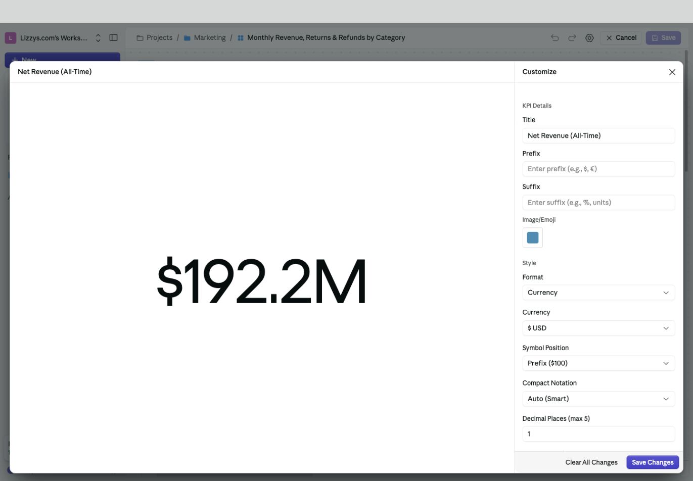
The preview shows how the chosen currency, compact notation, and decimal places will appear.
Reading the data
A KPI shows a prepared metric result. Check its definition, filters, and period before formatting it. A missing value is different from a genuine zero; investigate the source rather than adding a display prefix or changing precision to make it look complete.KPI types
A result can be a number, percentage, trend, or comparison. These describe the result itself. The Format control changes how its values are displayed; it does not turn a single number into a meaningful comparison with a previous period. Ask the Analyst for the calculation you need, such as “Show completed-order revenue for last month and compare it with the month before.”Display options
Use Title for a label the audience understands. Add a Prefix, Suffix, or Image/Emoji where helpful, and check the preview for duplicate units such as a manually entered dollar sign next to a currency format.Number formatting
Choose the format that matches the meaning of the value:
The options beneath Format change with your selection. For example, currency formatting offers compact notation, decimal places, separators, and negative-number presentation.
Changing a currency label does not perform an exchange-rate conversion. A rate stored as
0.25 needs different percentage handling from one stored as 25; confirm the input scale in the preview.